Politics, personality and pastimes
Research data suggests that, in terms of their personalities, Reform voters are on average the least agreeable, while Green voters are the most neurotic.
As for their pastimes, Greens seem to enjoy going for country walks and Tories doing the gardening, while Reform voters do not like watching BBC news.
And in terms of shopping, Morrisons appears to be the large supermarket chain with the most politically representative clientele.
I have derived these little nuggets of political analysis from a new dataset published last month by the British Election Study (BES).
The BES is a long-running academic research project involving extensive surveys of voting patterns, political attitudes, and demographic and social characteristics.
In the past week or so I have read three substantial pieces of political analysis which rely on the latest BES samples, by Ben Ansell of Oxford University, James Breckwoldt of Manchester University, and Dylan Difford of YouGov.
They are revealing and thought-provoking articles about parties and social class, the traits and attitudes of Reform supporters, and how public opinion has shifted in the past year, and I recommend them all.
However it is also possible to find amongst the riches of the BES datasets some minor gems, which are perhaps less politically significant but are nevertheless intriguing in their own way. So I’ve been looking at the most recent BES sample (wave 30).
When I refer here to voters for a particular party, that is based on how survey participants (sample size of over 6,000) say they voted in the May 2025 local elections in England, which saw major advances for Reform.
Personality
If different humans have different personal dispositions towards, for example, behaviours like self-reliance, trust, flexibility, boldness, anxiety, diligence, and so on, then (whatever the difficulties in measuring these) it is not surprising if features of this kind have some influence on political attitudes, as one factor among many.
The latest BES survey contains scores for aspects of the personality of respondents, tied to the so-called ‘Big Five’ psychological traits: agreeableness, conscientiousness, extraversion, neuroticism and openness.1
These ratings are based on the participants’ answers to a battery of questions aimed at identifying those broad characteristics.
Not everyone agrees this is a valid model of human nature or that self-completion is a reliable method of assessment, but it is dominant in the field of personality psychology and widely used in commercial and academic research.
This table shows the average score for each party’s voters on a scale for each of these personality dimensions. The maximum score in each case was 20.
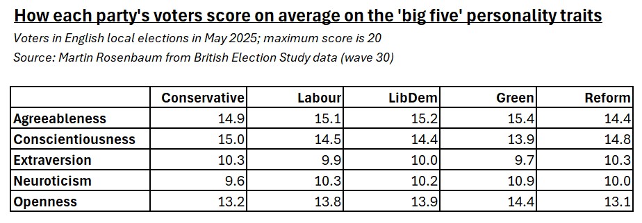
The variation shown here isn’t massive, and the sample sizes for the party breakdowns aren’t very large. But the overall pattern is consistent and fits well with previous research on the same subject: right-wing voters tend to be more conscientious and extravert, left-wing voters tend to be more agreeable, open and neurotic.
What’s different here is that in the past in Britain this was mainly a Conservative vs Labour contrast. The rise of other parties means that we can now see these tendencies particularly sharply in Reform and Green supporters, who are likely to be especially right-wing and left-wing respectively and appear to have the personality characteristics to go with it.
So Green voters seem to have the highest average ratings for agreeableness, openness and neuroticism, and the lowest ones for conscientiousness and extraversion.
Reform voters tend to score the lowest on agreeableness and openness. It’s the Conservatives who register the highest scores on conscientiousness and extraversion, and the lowest on neuroticism, while Reform voters are second in each case.
The average personality ratings for Labour and LibDem voters are very similar to each other and middling.
Bear in mind that all these numbers here are averages – there is a lot of scope for individual variation.
Activities
The BES has also asked survey respondents a collection of questions about what leisure activities they participate in.2
The results suggest that Green voters are the most active in all sorts of ways, which may reflect their younger age: as well as country walks, this includes attending gigs and going to the gym, and perhaps more surprisingly even eating at McDonalds.
Reform voters seem to be much less active generally, at least in the sort of pastimes that social scientists like to ask about. However Conservatives apparently enjoy visiting stately homes as well as gardening.
But in my opinion the most interesting and revealing comparison between the activities of different party supporters lies in who watches BBC news.
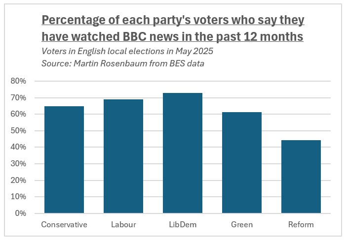
This shows how Reform voters are much less likely to be getting their news from the BBC.
Only 44% of Reform voters said they had watched BBC news in the past 12 months, compared to 61% of Greens, 65% of Tories, 69% of Labour voters and 73% of LibDems.
Supermarkets
There’s also a BES question about which supermarket respondents use for most of their food shopping,3 and there are some political differences in the answers.
So 30% of Reform voters say Tesco, compared to only 17% of Greens. However some shopping preferences are shared by these two groups: 21% of Greens and 19% of Reform voters do most of their shopping at Aldi, compared to only 11% of LibDems.
The most politically balanced large supermarket chain seems to be Morrisons. This is favoured for most of their food shopping by about 6-7% of each party’s voters.
I don’t know if the chance to chat with a good range of fellow customers counts as another reason to shop at Morrisons, but if so it’s another useful by-product of academic research.4
Notes
1 See p14 of the survey documentation; the sample size for this is 3,077. By the way, if you find any of this personality terminology to be annoyingly judgmental about human characteristics, don’t blame me, I didn’t invent it.
2 See pp 650-652 of the survey documentation; the sample size here is 1,476.
3 See p649 of the survey documentation; the sample size for this is 1,461. But note the party analysis for this question involves splitting the sample two ways (by party and preferred supermarket), so the cross-cut sub-samples will be much smaller.
4 I haven’t told you some of the other fun facts to be found in the data, such as that Green and Reform voters are the most avid readers of horoscopes, and Labour voters are the most frequent visitors to the opera and the least likely to do their shopping at the Co-op, while LibDems are the keenest on shopping at Waitrose, but sadly the numbers involved in these cases are so small that we can’t place any reliability on these findings, and thus, as Wittgenstein said, for those things of which we cannot speak, of them we must be silent.
Politics, personality and pastimes Read More »